

Showing posts with label rendering. Show all posts
Showing posts with label rendering. Show all posts
9.05.2012
Currently Working On....

8.20.2012
Currently on My Desk
I am currently working on a kitchen design for an Indianapolis couple that just purchased a historic fixer-upper. I wanted to give them some options to look at, but also I wanted to show how easy it can be to change the feel of a space with cosmetic changes. The couple I am working with is young and fun and wanted a kitchen to suit. The first is an updated look maintaining the traditional feel of the home, the second one is more modern with the finishes, keeping the overall look more what they had in mind. I rendered the third option just for you readers to show how simple cosmetic changes can completely transform a space.


11.03.2011
Rendering: Store Front Stripes

I found this image around the net {probably on pinterest} and just had to render it. I don't know if its the black and white striped awning, or the brick with the planters, but this looked so charming.
10.21.2011
Pauline Sofa

8.23.2011
Have a seat


This was an exercise in chairs. I do this frequently when I don't have a drawing to do of a room, or don't feel like doing an entire rendering. Chairs are a good lesson in proportion, shade and shadow, and texture. I like doing this with furniture because it doesn't take long to get a finished drawing. The last chair was done in colored pencil.
7.26.2011
Rendering

I like the idea of updating a brick fireplace with a new mantel surround. It can update and neutralize what could potentially become an eyesore.
7.20.2011
New Rendering

I did this rendering of a stone cottage interior, and I am mostly satisfied with it. The french doors were beautiful and it had a very nice garden showing through and that was the reason I wanted to render the space so badly. The flooring is a nice tile floor in a herringbone pattern with a wool rug over the top to tie in to the stone wall.
5.08.2011
One Kitchen 3 Ways
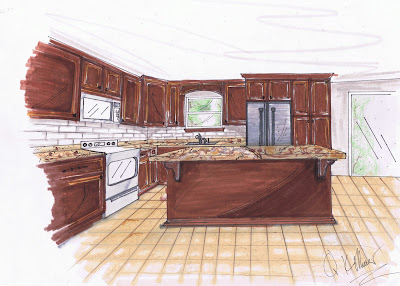
Time for yet another kitchen rendering. For work I am working on a project, for the seminars we are putting on soon, called one kitchen 3 ways. It is designed to show a full kitchen renovation on a 3 budgets. The first and second option are the same rendering the only difference being the appliances, granite, and a backsplash. The third option is a full custom option with the upgrades to match. The totals range from $17,500 to $58,000.


4.24.2011
Rendering


4.12.2011
Excitement
So my boss saw some of my renderings, liked them, and asked me to do some for his company websight!! He gave me some pictures of his kitchen and this is what I did. Its a scan so the colors are off a bit but that's ok


2.13.2011
Rendering

I found this image in several locations online and decided I just had to do a rendering of it. I don’t know where it originally came from but I loved the door. It was originally a bright mustard color but I didn’t have the marker equivalent. I wonder what the inside looks like with such a fancy entrance.
2.04.2011
Rendering

I am thinking of painting my room a dark blue-gray color. Now this is not my room but it’s much nicer than the one I have.
1.24.2011
Rendering 2 More Options
Option 1:
 This one is similar to the first one I did but I changed the floor, cabinet molding, counter top, and back splash. The colors are mostly the same, but there is some added contrast.
Option 2:
 I did a reverse of the colors in option 1. I went with a light tile floor, dark cabinets and a lighter counter top. The back splash is the same, the fixtures are the same, and so is the wall color.

Option 2:

1.17.2011
Rendering
This is a slightly spruced up version of my kitchen. I didn't change much but it looks a lot better.


1.01.2011
Happy New Year
So its a new decade and the perfect time for it. I started a blog, graduated, and I am now working on my internship. The new year is going to bring a lot of change for me, but if ever there was a time for it, the new year is it. So here is my first rendering of 2011


12.30.2010
Rendering

I did this rendering from an interior I found on Design Sponge >> sneak peeks. The original had a red wall but I was feeling the dusty plum color. I did this one on different paper than I normally do so my leather chair rendered a little funky, but it could look worse.
12.16.2010
Holiday Rendering

I did this rendering because I was feeling the holiday spirit. I saw this cabinet when I was looking for holiday decoration ideas and I thought it was really pretty. I just added some cabinets and an island to make a festive holiday kitchen rendering. Unfortunately my pesky right hand smeared the dark black marker all over my nice cream colored wall, but I will just call it texture. I had to cut the bottom off of the rendering to fit it on my scanner, but the island has white classic style cabinets with pewter hardware. It looks amazing; just take my word for it.
11.23.2010
Rendering
I did this rendering in order to work on my wall covering textures. I was trying to make a linen texture, it was too heavy and my lines were too thick. I think I will try again and post the difference. Over all it could be worse, but its a place to start.


11.17.2010
Renderings


10.19.2010
Rendering
I have a home file on my desktop where I keep photos of inspiration. I had this in there, for who knows how long, because I liked the color of the wall covering. I want to paint my next room a gray/blue color and I liked the white leather lounge as it pops off the dark color. The photo had beige carpeting under the rug, but seeing as how this is my rendering, I decided to give the room wood floors. I think it looks better, but don’t tell.

Subscribe to:
Posts (Atom)
